
A casual fan's guide to advanced stats, explained in casual hockey terms
Let's talk numbers without talking numbers.

When I sent out a survey in June, I got a lot of feedback. Some things I expected, some things I didn’t, but one of those unexpected requests was more exploration into hockey’s most popular public models on player data and player performance. Which is great!
For my part, I’ve written extensively on analytics themselves, even doing a massive explainer tome at Defending Big D; possibly the longest hockey article in existence (this is not to sound self-aggrandizing; the article literally clocks in at 34 minutes, which I suspect is at least near a record). Unfortunately it’s hard to follow, as the images didn’t get transported from the old CMS to the new CMS. I’ve always taken it on as my mission to integrate analytics in an accessible way into my writing. However, it’s easy to forget that as your audience grows, so do the new faces. And new faces may be wondering if I’m even watching the games given how many ‘spreadsheets’ I post.
I hope the current system has been a good start: every graph used here at the Stars Stack will have a caption with a link to a Substack Note that explains the stat itself, where it comes from, the question it wants to answer, how it seeks to do so, along with further reading from where it comes from. But I know it’s not enough. Knowledge is always evolving, and that means so is our understanding.
Why I’m doing this is simple: I sympathize with the casual fans who aren’t interested. Rarely is an effort made to make them clearer, and more accessible. Instead, the so-called “chart huggers” are always on the defensive, either focused on combating conventional wisdom or always detached from a universal dialogue in favor of chasing the next insight. Because of that, fans see the sides in the debate before they ever get to process what’s being discussed and presented. And that’s unfortunate.
I want to change that, and I know it’s not changing fast enough. It’s 2024, and we’re still hearing major telecasts poo pooing “analytics” so we can get actual grade-A analysis, like where Jared Bednar’s hair rates on a scale of 1 to Brad Pitt. Sure, it’s great for the telecast to have fun, but in the absence of everything else? That’s not my jam, and if the people in my social media mentions are any indication, it isn’t the jam of most fans either. Hockey fans know hockey, now more than ever. Nobody wants a TED talk during hockey, but nobody wants a hacky podcast in its place, either.
Instead of being afraid of them, I want us to turn them into something no different than the latest pop culture reference — when they happen, we can pop them into a casual conversation. We can talk about synthetic goals in the same tone as “cool dragons, huh?” after a HotD episode (don’t look at me, George R.R. Martin uses that acronym for the new show), or the cameos from Deadpool. Yes, I know we’d never actually do that because dragons and Juggernaut jokes are fun while regression analysis is not, but you get the point. To quote the famous Nobel Laureate in physics, Marie Curie, “nothing in life is to be feared, it is only to be understood. Now is the time to understand more so that we may fear less.”
What follows is a list of every explainer card, along with a casual summary of why and where I use them. With so many different models, it’s important to distinguish the subtle differences, why you should pay attention, and when and where they should be applied. The more transparent I can be in my analysis, the easier it is for you, the reader, to make your own decisions, and the more dialogue we can have. It’s that good faith dialogue where we find truth, IMO. So that’s what this is: a search for truth. We all know how to watch a hockey game. But do we understand it?
Below are the 10 explainer cards (three of which were added yesterday) I’ve assembled thus far, and with it some casual commentary about them.
Programming note: Many of these notes will be edited, or added to over time. I don’t pretend to have a full grasp of these, and as such, intend to continuously curate them as best I can. In the meantime, if you can’t stand analytics to begin with, then tune in next week for Texas Stars stuff (Monday), a discussion about the slapshot (Tuesday) and some general Dallas Stars notes (Thursday).
Synthetic Goals (sG) by Micah Blake McCurdy
This might be the most advanced model of all, at least in my estimation. Not only is it fresh, but McCurdy is attempting something a little different. I use these a lot precisely because I think they’re the quickest way to give fans perspective on a player. What can be tricky about this model is that because it’s so into the weeds about summing up a player’s shift to shift rating, specialists — think Julius Honka or Radek Faksa — can end up looking quite valuable.
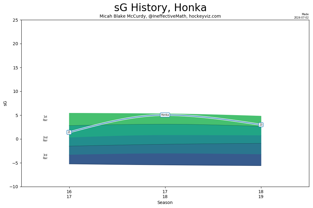
And now Faksa.
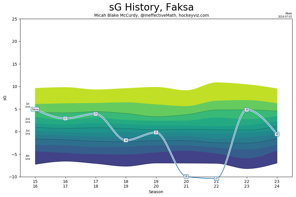
Faksa had what might have been his worst season in a Stars uniform. On a point per game basis, it was his statistical nadir. The end result is a player, once adored in a more limited role (where he exceled), getting healthy scratched and in the end, discarded. But sG found him to be more valuable, likely owing to his - still - strong defensive impacts. So how does he rate higher than a player (in this case, Joe Pavelski) who scored 67 points?
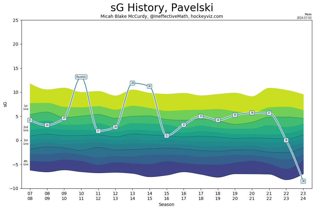
What is true of McCurdy’s model is true of many more we’ll discuss: these advanced stats are not how we make sense of outcomes, but how we make sense of methodologies — which is what they really are. This chart is not saying “Pavelski is worse than a 4th liner while Faksa is a mid-level 3rd liner.” It’s saying “I’ve created this mathematical procedure to help us determine the scheduled net value of a player, from shift to shift, in proportion to his peers. By that estimation, Faksa was more valuable even strength performer outside of his production than Pavelski.”
Setting by Micah Blake McCurdy
I feel like this stat speaks for itself, and thanks in large part to Corey Sznajder, we now have an answer. It’s also really important, as I think hockey has largely undervalued playmakers — something that has changed in recent years, but not fast enough in my view — and it’s a crucial part for defenders in being able to break out of the zone.
Goals and Wins Above Replacement (GAR and WAR, respectively) by Josh and Luke Younggren
In my experience, this is a really good place to evaluate shooters. How much of their goal-scoring is sustainable? Is there a discrepancy between what they generate from shift to shift versus what they generate from chance to chance?
Nino Niederreiter in 2018 is a great example. Long considered an analytics darling, he struggled to produce in his final season with Minnesota, and in the end was traded for another struggling player in Victor Rask. Nino was a hell of an offensive player that year, with strong impacts on shot quality as well as goal-scoring. The hockey gods simply didn’t reward him.
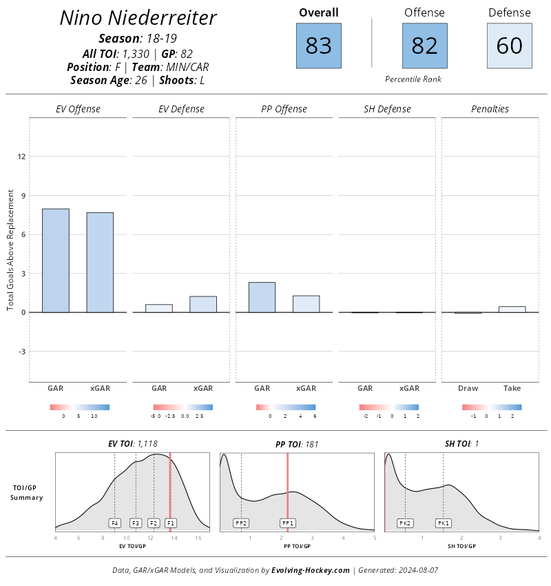
The player he was traded for, who was also struggling? Well, he was struggling because he wasn’t a good player at all.
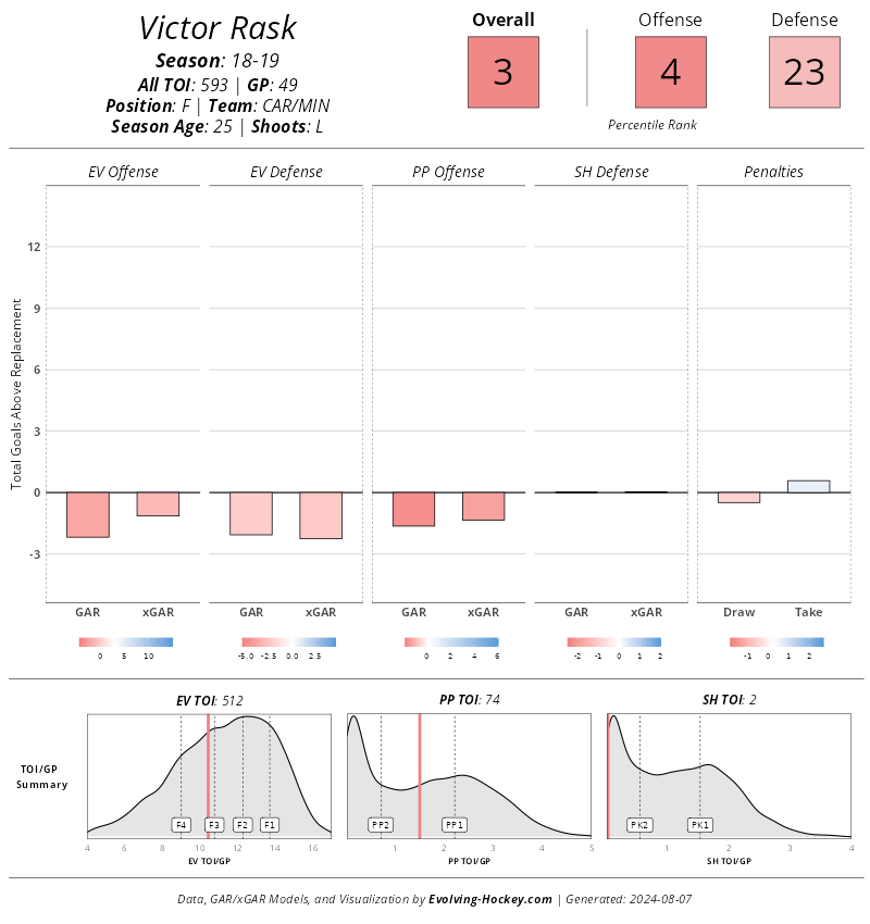
The fact that these two players were traded for each other says everything you need to know about how warping outcome bias can be.
One place I usually find less use for these is in assessing defensemen. And in point of fact, Josh and Luke Younggren argued the same exact point in their interview with Prashanth Iyer, and Sean Shapiro. However, I agree with both that it can be overstated.
After all, while advanced stats are all about everything going on underneath, outcomes are still important. For players who are outcome-based, this data can strengthen our understanding of them. It’s one of the reasons why I found it useful to include in our player grade of Thomas Harley. He’s incredibly talented offensively, and a clear threat to score from the backend: so how did he rate against his peers, and was it coming from a sustainable place?
Regularized Adjusted Plus Minus (RAPM) by Josh and Luke Younggren
Methodologies might be difficult to explain in laymen’s terms, but sometimes on-ice examples reveal how intuitive they actually are. Of all the methodologies that bring us closer to categorizing performance, RAPM is one of the best tools. Let’s demonstrate!
Take away the production totals, and which forward would you prefer? Matt Duchene or Logan Stankoven? If you’re like every other Stars fan, this is obviously easy to answer. However, what if you were only allowed to use your regular season games as your only guide? After all, Stankoven was only on pace for 48 points to Duchene’s 65. As for this question through a RAPM lens, the choice is clear, and it’s the choice of a few generation…
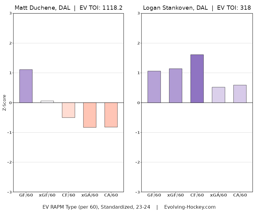
For shift-to-shift value, there are few better alternatives, because each element is divided on its own, keeping us away from the distraction of grouping players into mathematical bins.
Delta Fenwick Save Percentage (dFSV%) by Josh and Luke Younggren
Not gonna add much to this except to say that, as with the Jake Oettinger report card, this stat is crucial to distinguishing between determining consistently good, widely varying degrees of good, consistently average, chaotically average, consistently bad, and widely varying degrees of bad.
All Three Zones tracking data by Corey Sznajder
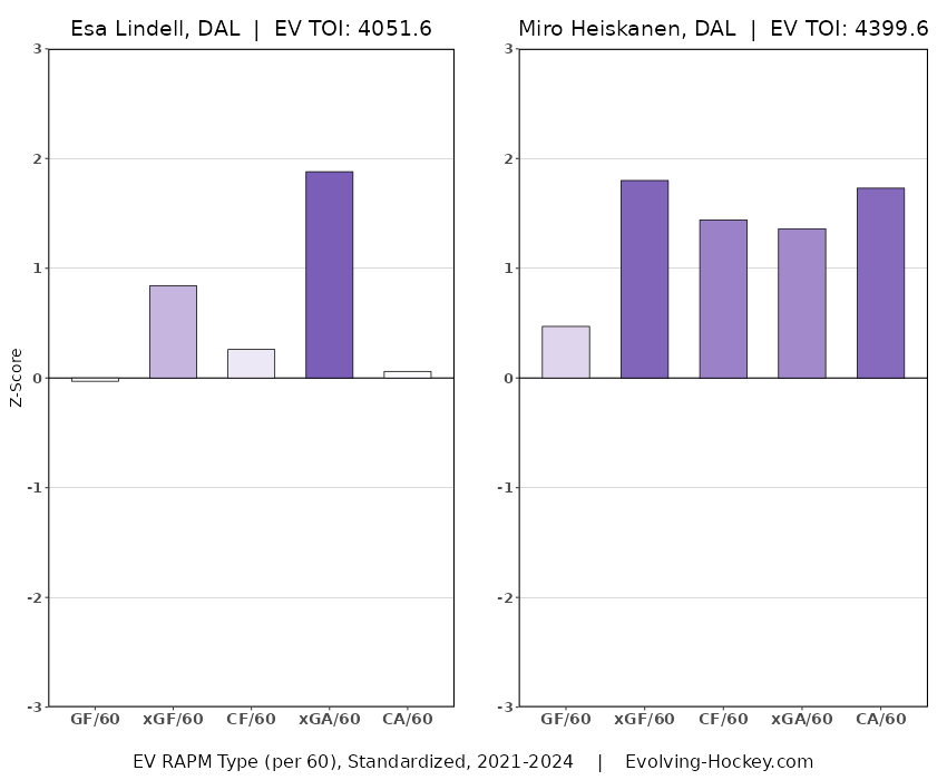
It’s been said that these are not great for assessing performance. I disagree. I would amend that to say that this might be broadly true of forwards (itself a suspicious claim), but it is not true of defensemen. I think Corey’s microstatistics are great for assessing the performance of defensemen precisely because it captures more of their impact across all three zones. Defensemen naturally consist of more player types, and have less duties bound by outcomes. For example, using RAPM, Esa Lindell (.356 in shot quality differential per game) grades out as a higher-performing defender than Miro Heiskanen (.336).
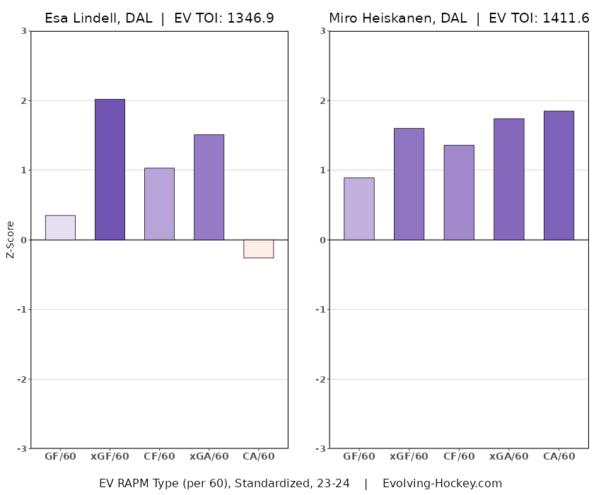
Yet a more composite look at transition data makes it clear who is actually more dynamic, and simply better on every level.
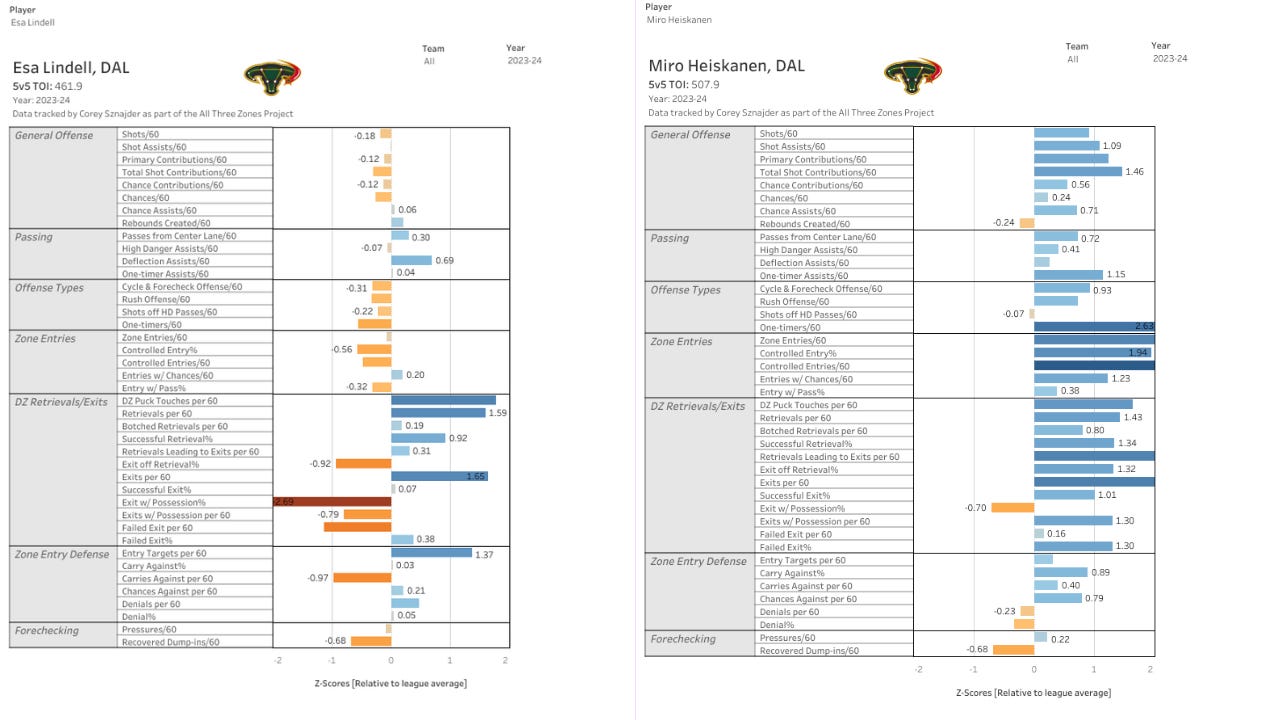
To those of us watching closely, this is abundantly clear. The discrepancy makes intuitive sense IMO, as a defender’s performance is less outcome-based. Like goalies, who rely on mercurial traits like positioning, shot-based outcomes can create as much noise as, say, erratic neutral zone data in relation to a scoring forward. My point here is not to use one example to counter an entire methodology. RAPM is important information. Corey’s tracking data is important information. This isn’t to establish a side on which one methodology is better, but to highlight how microdata, more than simply a reference, is critical to assessing performance for defenders, and not just impact. Although to be fair to RAPM, when weighted over three years, this comparison is a lot less closer.
Mitchell Brown and Lassi Alanen’s prospect tracking data
I consider data an essential part of my amateur coverage on draft stuff precisely because it really is hard to watch the games (time zones, and the whole thing about this not being a full time gig). However, I would take it seriously even if I were a pro scout. It’s easy to watch a player a get a sense of why they are. But how do you have a sense of how they are, not just compared to their peers, but categorized against them? Enter the data dragon.
Below are the recently-added explainer cards.
JFresh’s Hockey Cards
Deserve to Win O’ Meter by Peter Tanner (MoneyPuck)
Net Rating by Dom Luszczyszyn
As mentioned, I’ll be sure to continue adding to these, and refining them as my understanding of them is refined. I know that not everyone is interested in this stuff, and even those that are may be feeling a sense of analytics fatigue. But for those that are, this is for you.
Excellent
David I tend to use some of these analytical tools to confirm what l see with my eyes . An example , Pavs was going downhill fast from an eyeball viewpoint , the analytics only confirmed this trend . Last season my daughter would often text me saying my goodness what’s up with Pavs and she is not an analytics follower